
We started with an intrersting introductory activity: arranging “data” in our bags.
I organized the items roughly by size, while other people categorized based on functions, values, and other criteria. This helped me better understand the concept of data visualization, the methods used to organize information, and how different approaches can shape the way data is interpreted.

In the small group, we analyzed data on rising rental prices in London and found this issue to be particularly notable in areas where schools gathers, impacting students’ living conditions more than other groups.
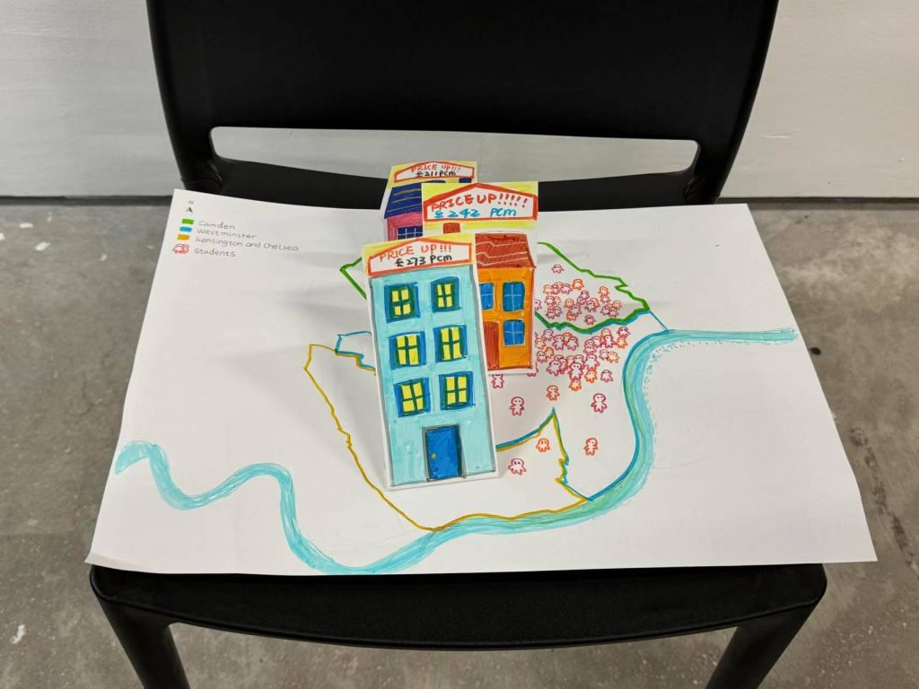
Based on the Borough map of London, we combined the price tags of commercial products with the varying heights of houses to visualize the rising rental prices, and used different numbers of people to represent the sizes of student populations in each area.
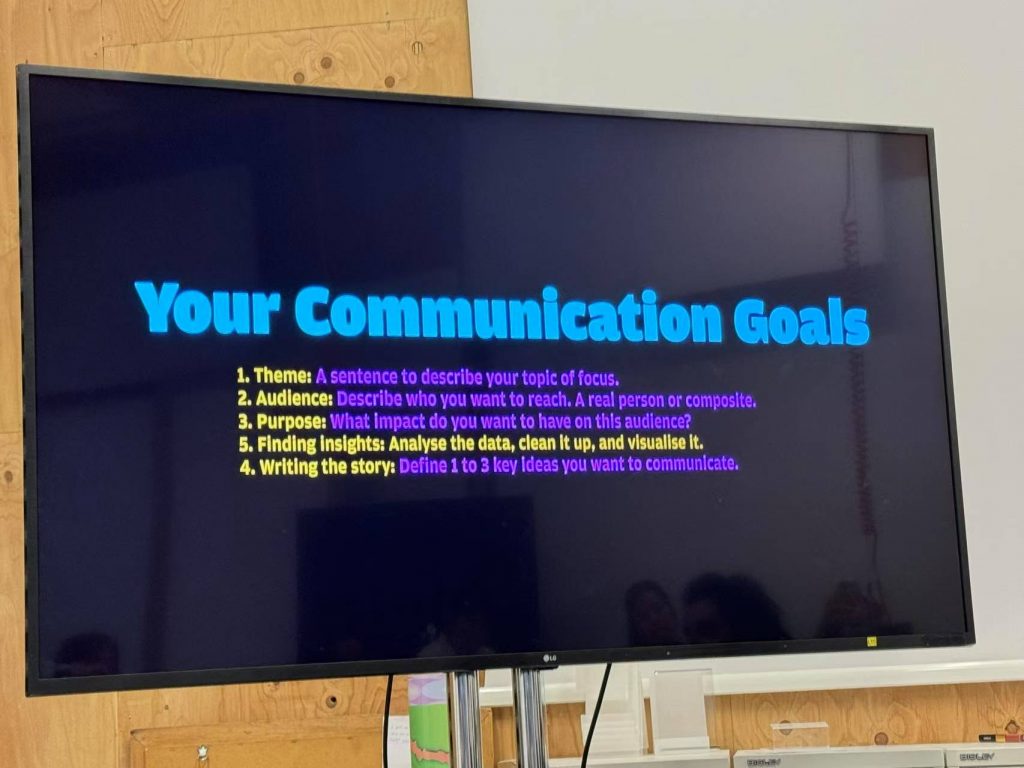
Reflections:
- Remember to clarify the source of data (e.g. what year it is from?)
- Color codes have meaning (such as genders),therefore should be used carefully when representing people or other information.
Leave a Reply